
Looking back at Disney.com in 1996 via the Wayback Machine
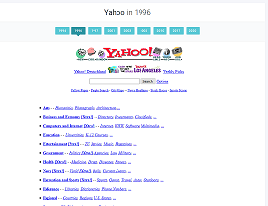
Do you remember sitting down at a computer, opening up the browser, and waiting for Yahoo to load so that you could then check on your favorite sites or in my case play games somewhere. For this reflection, we’re taking a look at website design in the 90s and seeing just how far we’ve come. Given that Walt Disney World is the reason I moved from small town Indiana to Florida I thought it fitting we’d take a look at their site and compare it to now.
Disney officially launched its website on February 22, 1996, although according to CNET1, Netscape and AOL members had early access to the site starting February 12th. Thanks to the Wayback Machine of the Internet Archive we can take a look back at Disney.com as it looked on December 27, 1996.
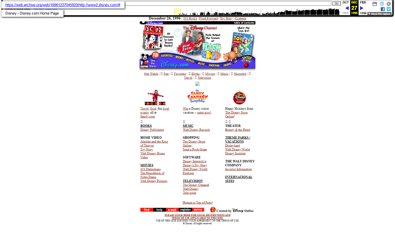
My first impression is that there are a number of elements competing to draw my attention. My eyes don’t know where to look. We have three graphics in the center of the page that don’t seem to be separated enough to stand alone, nor cohesive enough to be seen as one element. The purple border line along the bottom draws my eyes from left to right with the movement of the links and the red “button” link to the far right. Mickey almost seems an afterthought being at the far left of that purple line given my eye is more drawn to the red “Fun” button to his right than Mickey himself. Looking to the top of the page where I’d expect to find main links based on today’s websites I do see a few links just above a black line that contrasts with the purple line below. While there is a link to “Contents” in the upper right, the other three links seem to be for the three main graphics in the center of the page. Only by scrolling down the page do we find the information I’d imagine we’d be looking for such as links to their theme parks, movies, and television.
Moving on to the fonts and colors used, while the yellow text on the purple background has great contrast and makes the text easy to read, those are not colors I’d associate with Disney. This also seems to be the only use of these colors aside from the words “Disney.com” being “highlighted” in purple in the upper left corner. We do find “Disney.com” again on the page in the special Disney font, but this time in a lighter blue, which against the purple background it’s placed against on the bottom of the page makes for an odd color combination. Disney did choose font types that are easy to read on the page when your eye can pause long enough to read them.
I’d also forgotten how much we loved animation on websites in the 90s. (We also loved sounds playing, but thankfully the Wayback Machine didn’t record any sound that may have been playing on Disney’s home page at the time.) This main page only has one element of animation (that was saved with the archive, it wouldn’t surprise me if other elements of the page had motion as well that weren’t captured in the archiving) which is found below the bottom purple border. Recalling the difference in monitor sizes and resolutions back then, I’d imagine that everything below the purple border required scrolling down to see, including the little girl animation just above “family.com”. Today we can see the entire page at once and recall just how overwhelming and distracting all of those animations could be.
Visiting a website of the past reminds me just how far web design has come in a little over twenty-five years. Not only was this site overwhelming to look at visually it was also hard to locate information. Given that this website was also built before viewing websites on tablets and smartphones I also can’t imagine trying to view it on such a device today, you’d be scrolling left and right as well as up and down. Modern websites are made with this in mind (the good ones, anyway) and also with making it easier for viewers to quickly find the information they need. Take a look below at a comparison between Disney’s 1996 site and their current (2022) website.
Huge difference, right? Not only do you have the main categories found easily in the top left-hand corner (parks, movies, shop), but you also have a search bar just in case you don’t want to see what’s under “more”. The center has one clean graphic focusing on one Disney property. And while it has images of more properties below, they’re all the same size and shape, with white borders clearly separating each one. I certainly prefer this version of the site and I’m very glad we’ve moved on from more novel or gimmicky type websites of the 90s to cleaner ones where information is easier to find. What was your favorite website in the 1990s? Tell me about it in the comments below and we can all reminisce together.
- “Mickey Mouse makes Web Debut.” 12 02 1996. CNET. 04 09 2022. <www.cnet.com/tech/services-and-software/mickey-mouse-makes-web-debut/>.