
For this blog post, I’ll examine a manual to understand better what makes for a useful one. I’ve decided to look at an older manual for Adobe Illustrator 10 for a few reasons. One, it’s a complicated software program I don’t know, but I would like to learn it eventually. Two, Adobe products are often known for their steep learning curve, making a manual an essential tool. Finally, since Adobe software is generally obtained via a monthly or yearly subscription and downloaded rather than sold on a cd or disk as a one-time purchase, they don’t have any manuals I know of anymore. Instead, they focus on providing help and tutorials online. If you’d like to look at the manual, it’s available at Manualslib, the ultimate manuals library.
I began by reading the article “How to Write A Manual That Your Users Will Love to Use” by INSTRKTIV. It breaks the contents into five sections (or chapters as the article refers to them), each focusing on a different aspect of what makes a practical manual that will be helpful and easy to navigate.
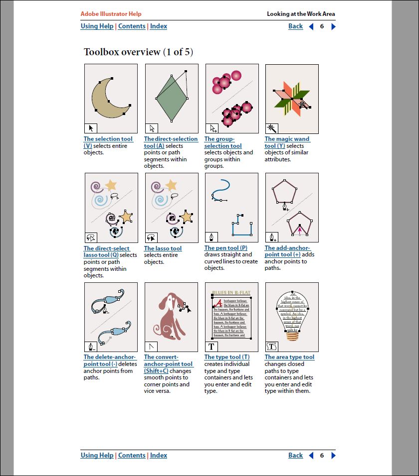
Let’s start by reviewing the positives of this manual. One of the first things I found very helpful was the “Toolbox Overview” that begins on page 6 of the manual. It has the icon for the tool inset in the lower left corner of an illustration showing how the tool is used. However, I wish they had named each section by the types of tools shown rather than just by number. For example, “selection tools” instead of “Toolbox Overview (1 of 5).
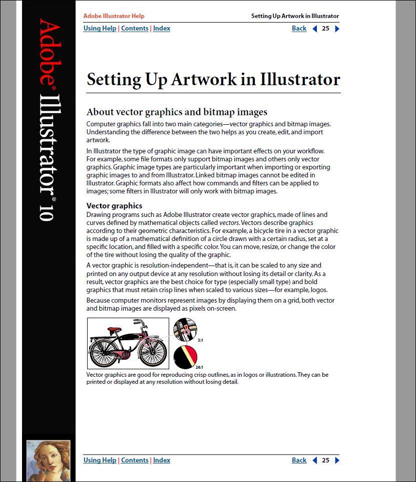
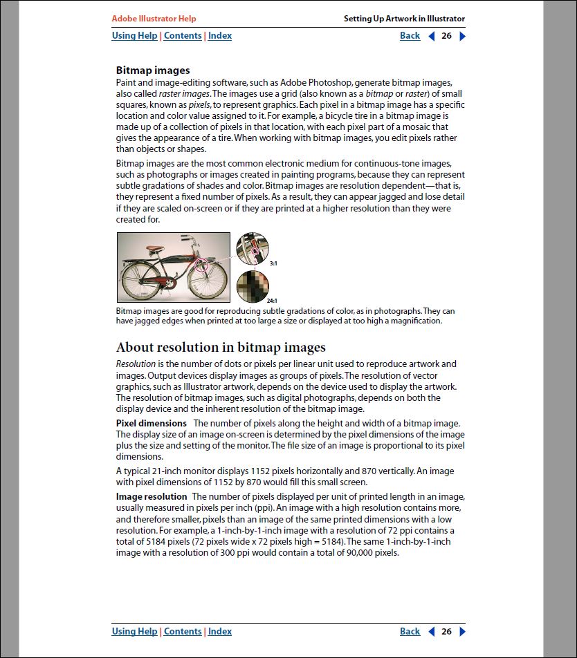
I also like the way each chapter or section of the manual begins with a little bit of background information on what will be covered in the section. For example, at the beginning of the section “Setting Up Artwork in Illustrator”, as seen in the screenshots below, it begins by briefly explaining what the two main categories of computer graphics are (vector and bitmap), and then it goes on to explain each one more in-depth along with showing an example. This is great information for someone unfamiliar with computer graphics and makes the information in the rest of the section much easier to understand. Those who already know about computer graphics, can skip over this part and go straight to what they need help with. Or they could if the headings and subsections were easier to find, but we’ll look at that shortly.
The manual also does an excellent job of explaining how to use various tools and features of the software that are easy to follow. Each one is numbered with bullet points to give additional information. The steps are also kept short, so you can easily track where you’re at without getting lost in a long paragraph. While some have screenshots, I think more would have been helpful. For example, on page 12, the manual explains how to use the “Info Palette,” but it doesn’t have a screenshot showing what the info palette looks like. That would have been helpful as a reference point when reading about what information the palette shows.
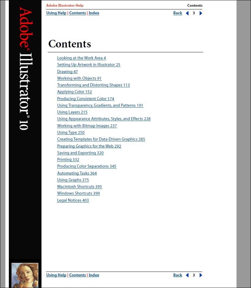
There are some improvements I would suggest if this manual were still in use today. The first would be to improve the table of contents which only shows the headings for the largest sections. This means that if I wanted to know how to use guides, I would need to know that information would be found under “Working with Objects” and then skim through that section to locate “Using Grids.” I would add all the headings found within each large section to the table of contents to make it easier for the user to find the information they need.
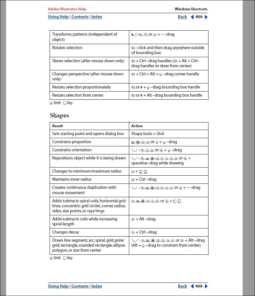
The last change I would make to this manual would be the shortcut sections at the end. The manual offers shortcuts for both Macintosh and Windows computers and has them listed in tables by type, for example, shortcuts related to shapes. However, I’m still unsure which keys on the keyboard to hit to use each shortcut. The tables list “result,” which describes what the shortcut should do. Then the tables list “Action,” which seems to have the icons for various tools within the software listed along with keys on the keyboard. Under each table in the Windows section (I focused on the Windows shortcuts since I’m not familiar with Macs), it shows the ‘up’ arrow symbol with “shift” beside it and a square symbol with “key” beside it. These symbols and the information in the table still don’t help me understand what I need to do to achieve the desired result. I would either make it clearer in the tables by adding another column or have an overview at the beginning of the shortcuts section explaining how to read the tables.
Overall I think this manual would have been beneficial when it was written. Adobe Illustrator 10 was released in November 2001. After reviewing the manual, I’ve also realized that even then, it was probably not printed but instead available online. This would have made it easier to use since you could have searched for what you were looking for, such as “how to show grids.” That would explain why the table of contents is not as detailed as expected. In any case, it was very informative to reflect on a manual for a piece of very complex software since we don’t typically see such in-depth manuals for software anymore.